Insights Into The Collective - Philip Jacobs Spring 2017
Hello beautiful folks, today we will be perusing through Philip Jacobs' six new designs for the Kaffe Fassett Collective.
Philip Jacobs
Philip Jacobs combines Kaffe's unique colouring with his intense botanical prints, which often have a stunning realism, to create a vibrant collection of floral fabrics that are almost too beautiful to cut up! Luckily the urge to create always wins…
For the Spring 2017 Collection, Philip has been inspired by the charms of the undersea world with his beautifully detailed ‘Shell Bouquet’, which comes in red, blue, yellow and pastel and features clumps of wonderfully detailed shells with sprays of branching coral. It is a very large design, with the main bouquet being approximately 12”x12”, which really invites you to just cut out a square and go from there!
‘Horse Chestnut’ is another intensely detailed design with the colouring to match. The richness of the leaves and the contrasting background colour make for a really stunning fabric. The colourways include brown, green and blue.
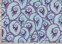
One of his more unusual designs in the collection is ‘Curlique’. It appears to be something similar to a begonia leaf crossed with a nautilus shell. Despite the ambiguous pattern, it makes for a beautiful repetitive design accentuated by the contrasting highlight around each shell/leaf. The green colourway is one of my favourite prints from the whole collection.
‘Summer Bouquet’ is a fabulous spray of roses, tulips and poppies which also feature a contrasting highlight around the edges of the flowers, particularly noticeable on the poppies. I really like the brown colourway, which has a lovely soft, antique feel to it.
His other new designs include ‘Glory’ in dark and pastel as well as the final addition to his collection which has made it to the coveted position (ahem) of my #1 favourite; Tulip extravaganza.
Specifically, Tulip Extravaganza in Yellow.
The first reason why I love this fabric so much is because right now my tulips are standing proudly along the border of my garden literally shouting "Look at me! I'm fabulous!".
Secondly, this design shows exactly why Phillip and Kaffe are such a dream team. On any other design, that brimstone yellow might look a little tacky or gaudy, yet the large and detailed design of the tulips paired with soft pinks and blues makes me want to sew a mid-length floaty skirt and run around the park channelling my inner Maria from Sound of Music.
That sum's up Philip's new designs for this year. Do you have a particular favourite? Let us know! You can browse our range of Philip Jacob's fabrics here
Tomorrow we will be delving into Brandon's new designs, and you absolutely MUST be there.


Comments